BreadCrumbs
Breadcrumbs show hierarchy and navigational context for a user’s location within an application.
Preview
Code
Installation
Copy and paste the following code into your project.
Update the import paths to match your project setup.
Usage
Breadcrumbs provide a list of links to parent pages of the current page in hierarchical order. Breadcrumbs helps implement these in an accessible way.
- Flexible - Support for HTML navigation links, JavaScript handled links, and client side routing.
- Accessible - Implemented as an ordered list of links. The last link is automatically marked as the current page using aria-current.
- Styleable - Hover, press, and keyboard focus states are provided for easy styling. These states only apply when interacting with an appropriate input device, unlike CSS pseudo classes.
import { Breadcrumbs } from "react-aria-components";<Breadcrumbs>
<a href="/home">Home</a>
<a href="/products">Products</a>
<a href="/products/123">Product 123</a>
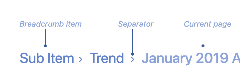
</Breadcrumbs>Anatomy
Options
Disabled
To disable the breadcrumbs, use the isDisabled prop.
Preview
Code
Seperator
To add a seperator between the breadcrumbs, use the separator prop.
Preview
Code
Sections
To add sections to the breadcrumbs, use the leftSection prop.
Preview
Code
Examples
With Router
Get BreadCrumbs directly from router ( this is Nextjs example )
Preview
Code
Props
Breadcrumb
| Name | Type | Description |
|---|---|---|
| leftSection | ReactNode | The left section of the breadcrumb you can place your icon here |
| seperator | ReactNode | Edit the seperator element ( the icon towards the right ) for the breadcrumb |
| children | ReactNode | The children of the breadcrumb, typically a <Link>. |
| id | Key | A unique id for the breadcrumb, which will be passed to onAction when the breadcrumb is pressed. |
| className | string | The CSS className for the element. |
| style | CSSProperties | The inline style for the element. |
Link
| Name | Type | Description |
|---|---|---|
| isDisabled | boolean | Whether the link is disabled. |
| autoFocus | boolean | Whether the element should receive focus on render. |
| href | Href | A URL to link to. See MDN. |
| hrefLang | string | Hints at the human language of the linked URL. SeeMDN. |
| target | HTMLAttributeAnchorTarget | The target window for the link. See MDN. |
| rel | string | The relationship between the linked resource and the current page. See MDN. |
| download | boolean | string | Causes the browser to download the linked URL. A string may be provided to suggest a file name. See MDN. |
| ping | string | A space-separated list of URLs to ping when the link is followed. See MDN. |
| referrerPolicy | HTMLAttributeReferrerPolicy | How much of the referrer to send when following the link. See MDN. |
| routerOptions | RouterOptions | Options for the configured client side router. |
| children | ReactNode | (values: LinkRenderProps & { defaultChildren: ReactNode | undefined }) => ReactNode | The children of the component. A function may be provided to alter the children based on component state. |
| className | string | (values: LinkRenderProps & { defaultClassName: string | undefined }) => string | The CSS className for the element. A function may be provided to compute the class based on component state. |
| style | CSSProperties | (values: LinkRenderProps & { defaultStyle: CSSProperties }) => CSSProperties | The inline style for the element. A function may be provided to compute the style based on component state. |
Events
| Name | Type | Description |
|---|---|---|
| onPress | (e: PressEvent) => void | Handler that is called when the press is released over the target. |
| onPressStart | (e: PressEvent) => void | Handler that is called when a press interaction starts. |
| onPressEnd | (e: PressEvent) => void | Handler that is called when a press interaction ends, either over the target or when the pointer leaves the target. |
| onPressChange | (isPressed: boolean) => void | Handler that is called when the press state changes. |
| onPressUp | (e: PressEvent) => void | Handler that is called when a press is released over the target, regardless of whether it started on the target or not. |
| onFocus | (e: FocusEvent\<Target\>) => void | Handler that is called when the element receives focus. |
| onBlur | (e: FocusEvent\<Target\>) => void | Handler that is called when the element loses focus. |
| onFocusChange | (isFocused: boolean) => void | Handler that is called when the element's focus status changes. |
| onKeyDown | (e: KeyboardEvent) => void | Handler that is called when a key is pressed. |
| onKeyUp | (e: KeyboardEvent) => void | Handler that is called when a key is released. |
| onHoverStart | (e: HoverEvent) => void | Handler that is called when a hover interaction starts. |
| onHoverEnd | (e: HoverEvent) => void | Handler that is called when a hover interaction ends. |
| onHoverChange | (isHovering: boolean) => void | Handler that is called when the hover state changes. |
Layout
| Name | Type | Description |
|---|---|---|
| slot | string | null | A slot name for the component. Slots allow the component to receive props from a parent component. An explicit null value indicates that the local props completely override all props received from a parent. |
Accessibility
| Name | Type | Description |
|---|---|---|
| aria-label | string | Defines a string value that labels the current element. |
| aria-labelledby | string | Identifies the element (or elements) that labels the current element. |
| aria-describedby | string | Identifies the element (or elements) that describes the object. |
| aria-details | string | Identifies the element (or elements) that provide a detailed, extended description for the object. |
Breadcrumbs
| Name | Type | Description |
|---|---|---|
| isDisabled | boolean | Whether the breadcrumbs are disabled. |
| children | ReactNode | (item: T) => ReactNode | The contents of the collection. |
| dependencies | any[] | Values that should invalidate the item cache when using dynamic collections. |
| items | Iterable<T> | Item objects in the collection. |
| className | string | The CSS className for the element. |
| style | CSSProperties | The inline style for the element. |
Events
| Name | Type | Description |
|---|---|---|
| onAction | (key: Key) => void | Handler that is called when a breadcrumb is clicked. |
Layout
| Name | Type | Description |
|---|---|---|
| slot | string | null | A slot name for the component. Slots allow the component to receive props from a parent component. An explicit null value indicates that the local props completely override all props received from a parent. |
Accessibility
| Name | Type | Description |
|---|---|---|
| id | string | The element's unique identifier. See MDN. |
| aria-label | string | Defines a string value that labels the current element. |
| aria-labelledby | string | Identifies the element (or elements) that labels the current element. |
| aria-describedby | string | Identifies the element (or elements) that describes the object. |
| aria-details | string | Identifies the element (or elements) that provide a detailed, extended description for the object. |